Multi Medical Center

All this without neglecting the needs of the users of the premises, with a focus on both the patient and the medical team working in the facility, to whom it was necessary to offer a workplace that was not only functional, but also emotional, welcoming and relaxing.
The aim was to ensure that those bare spaces and those anonymous walls regained new identities, no longer grey and bare, no longer still and silent, but full of motion, colour and warmth, thus creating an interior design intervention capable of multiplying spaces, involving and stimulating observation, reaction and, at the same time, feel safe and have peace of mind.
This research, which brought together design and culture, manual technique with the most sophisticated and refined technology of new modelled materials, almost as if to shape the space and render it immortal.
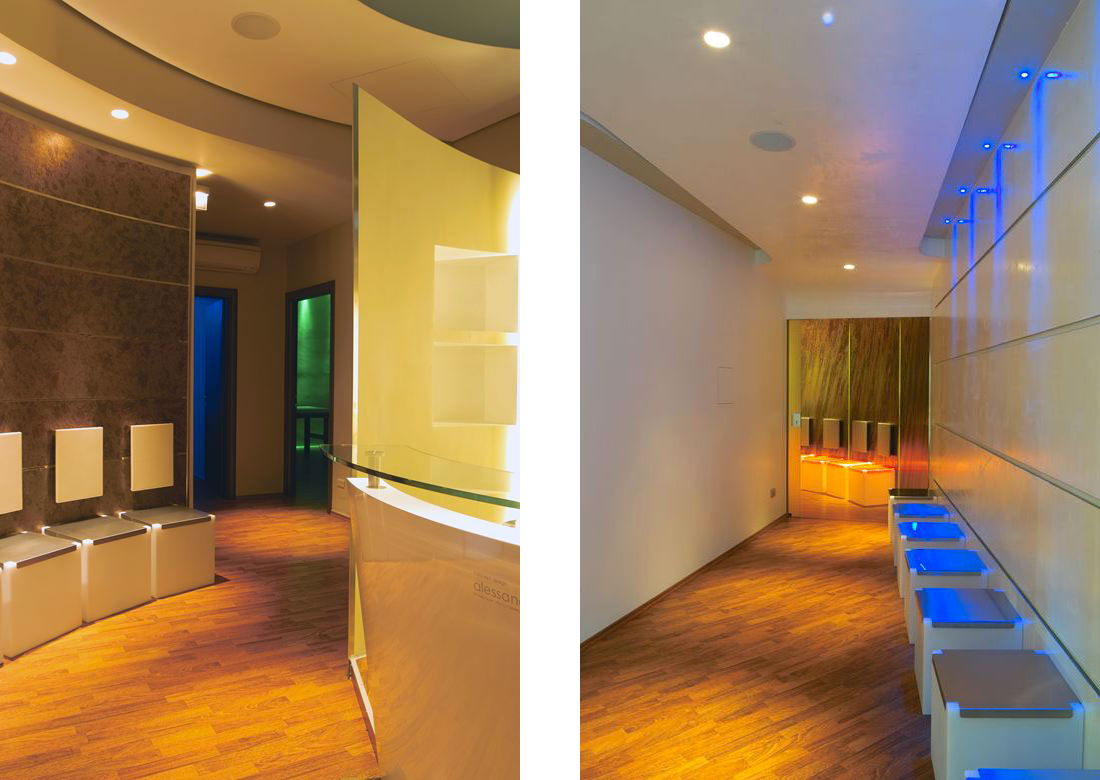
A game of circling the walls and ellipses on the lowered surfaces create concentric movements in the first waiting room to give the patient a sense of hospitality, as if they were entering their friends’ home. The reception, located in the middle of the waiting room, has an oval structure with a scenic backdrop, so as to create a point of reference for customers.
The specific appeal of this setting, which serves as both a container for the secretary’s office and to divide the medical surgeries, is the final part, designed specifically out of square both vertically and horizontally, with an arrow finishing to generate a sense of invitation to the other part of the surgery reserved for the ophthalmic department.
Within this circular wall, RGB light points have been set up to cast a diffused light onto every single portion of the circle.
Five specialist medical surgeries overlook this area: diabetology, psychology-psychiatry, natural medicine, paediatrics, cardiology.
Here, the designer wanted to generate a sense of “path of perception” by working on the linearity of minimal settings intentionally left white, like the colour of the walls and the interior design, intervening only on the lowered surfaces polished to a gleam with washable enamels.
To characterise and distinguish each surgery, only “spots” of colour were applied here and there, such as on the seat upholstery, the objects placed on the desk, and a “stain-resistant” wall panel placed behind the handwash, all in the same shade as the background lighting.
With the use of coloured LEDs, hidden in such a way as to obtain only a visual perception of the colour without any glare, a blue, red, green, yellow, orange and amber surgery were created. On the floor, doussie wood parquet flooring runs along the 200 square-metre concept.
The toilet for the public was entirely tiled in black porcelain stoneware, with the insertion of washbasins and taps designed by Alessandro Marchelli. The washbasins were made using oxidised iron, curved and treated with crystalline resin, while the taps, which are curved in the shape of a double “s” and fitted at a height of 2.00 m above the bowls, are made of copper and are sensor-operated.
The light is equally diffused here, hidden behind the wall of washbasins and behind the mirrors.
The point of connection between the area used for the various specialities and the owner’s ophthalmic surgery has been created by turning an existing gallery into a welcoming and additional waiting room.
The result is a white “new look”, finished with natural crystalline resins and a game of suspended interlocking ceilings, which continues with the “sensory path” of light with the insertion of narrow-beam blue spot LEDs directed at the brushed steel seating.
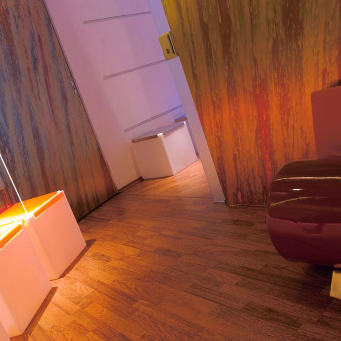
Once you have crossed this threshold, you enter the ophthalmic department, where a vertical “swerve” curve makes up the waiting room. The seats, made of orange polycarbonate, reflect the light and blend in perfectly with the shaded laminate walls in shades ranging from deep burgundy red to yellow-orange and violet blue.
Perfect vertical cuts of light have been created in this setting, which helps to give the patient a feeling of calm and relaxation while waiting to be seen, thanks also to the possibility of using the sofa with round burgundy and orange seat.
In the doctor’s surgery, dominated by shades of blue, a copper desk has been designed and built.
White has been used as the dominant colour in the examination room and in the operating room, with dimmable lighting (in the operating room only) depending on the requirements, for both the main and secondary light in blue.
Expressiveness and creativity in the eye space.
When Doctor Carlo Orione, ophthalmology specialist and owner of C.P.N. (Centro Polispecialistico Nicese) commissioned the AM+D Studio Alessandro Marchelli + Designers – Sensory Architecture & Design – to reinvent the premises, functionality and concept of the Nizza Monferrato multi-functional centre (Asti).
The Designer’s creativity released his desire for “sensory appeal”, his essence of design in finding a unique connection between light, sound, emotion, and the enhancement of emotional functions with absolute and careful research, amid quality, innovation, design criteria, elegance and home automation, functionality and feeling in a strong, yet calm, form.


