Seafront house
Annotations:
Today’s homes are more compact: minimum space means minimum expenses.
Today’s homes do not have high ceilings and long corridors.
Today’s homes require seamless and flexible passageways.
Today’s homes sometimes refute excess, frescoes, paintings and rugs, extras from the old times: they need to ensure fluidity, speed and unexpected savings.
In today’s homes, illegal annexes are on the rise, generating warped and dilated shapes and insidious legalised growths.
But in actual fact today’s homes need to be bathed in light indoors because often there is no light outside them!
First encounter. June 2014
The first encounter-survey takes place around noon on a hot and sunny early summer’s day.
We sat in the living room for a coffee. The dwelling spanned 90 square metres with a 40 square-metre terrace. As we talk, thirty halogen spotlights recessed into the suspended ceiling are pointed at our faces, our conversation, our bodies, which are already overheated by a steady sultry heat – approximately thirty-two degrees with extremely high humidity. I ask if they can be switched off, but the ensuing dim light makes us even more uncomfortable and insufferable.
I am not comforted by the thought that this discomfort is extremely widespread, like a virus, in many Italian interiors, especially from the 70s and 80s.
Those designed with the desire for floor space without any architectural quality, those built “just in case”, to be transformed at the right time, extended and expanded to the outside at the opportune moment. I think about this Italian sloppiness and about this type of building, resulting from such transformations and regularisations from the State. The same laws that rant and rave, sometimes making laws that contradict one another:
the important thing is to occupy space, generate large spaces over multiple square metres – even if warped – so what if they are dark?
In the words of Georges Perec: “To live is to pass from one space to another, while doing your very best not to bump yourself“.
Reflections on the word: Ample
It is a deep breath, filling lungs with oxygen and regenerating the mind.
It releases from rigid, senseless chains built to trap pre-packed lives. Amplitude is in the light that is lost inside material and in its details.
Amplitude is an open dialogue about the unexpected or in a beautiful tale generated by an image, it is in the air, in the breath among the things in a home.
It is the breath between things, it is light.
Ample: it is not a measurement to the nearest square metre!
Genesis:
These are the considerations behind my work on the Seafront house to the north of Rome owned by a young couple and their daughter.
The priority request is to rationalise the spaces, freeing them from the darkness and superstructures to amplify the reverberation of natural light – but above all restoring meaning to the word “ample”, anchoring it to the poetry of material and light.
This house is different.
I have always worked by starting off with a reading of the city, of the district; here, however, there is an urban stratification with no identity or history, if not that it belongs to a period of great construction-urban planning speculation which distinguished the 1960s and 70s.
I focused on a superstructure, albeit sometimes exasperated, where the theme of colour and the scattered material fragment is used to fill the need for space and light.
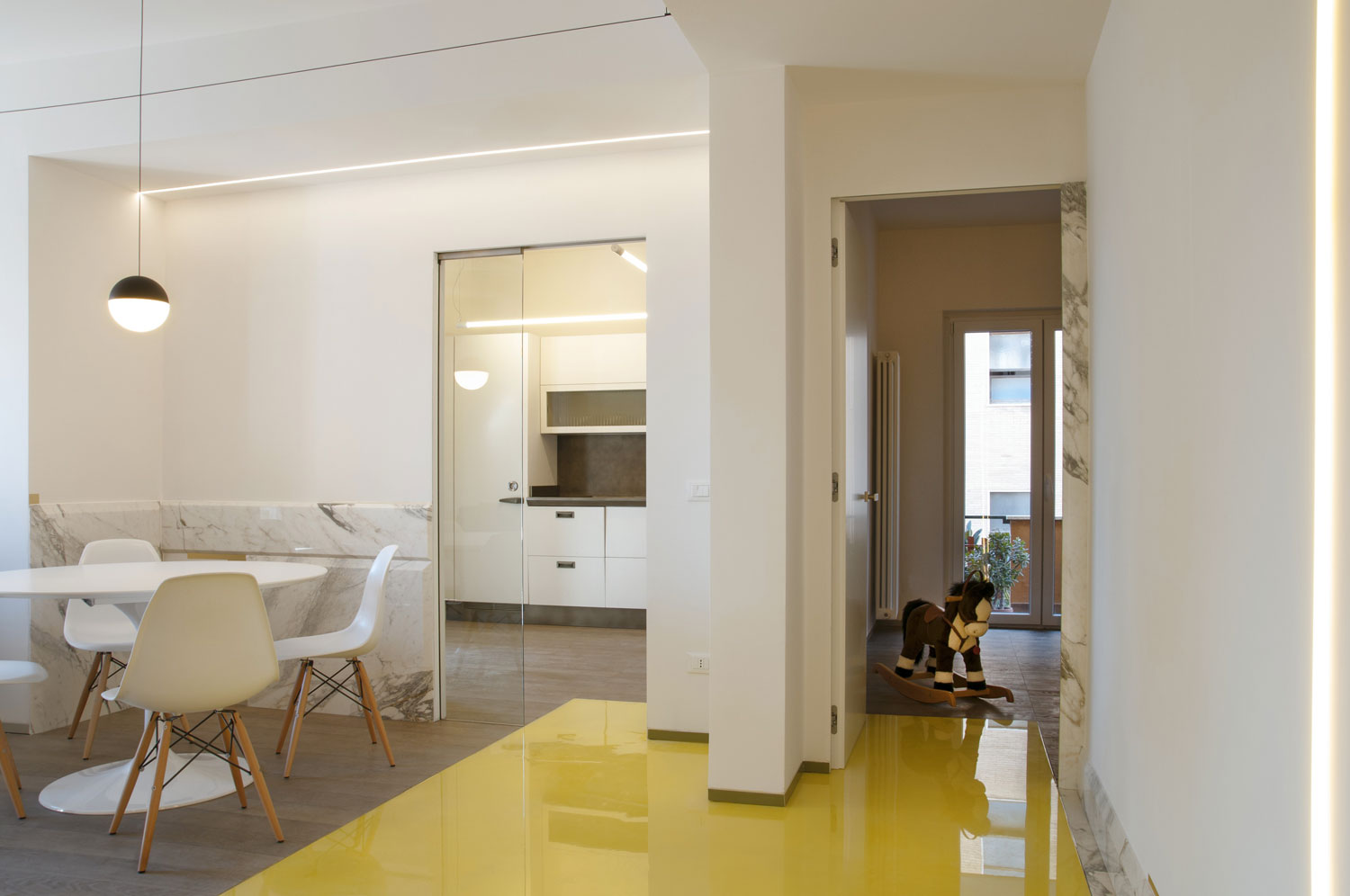
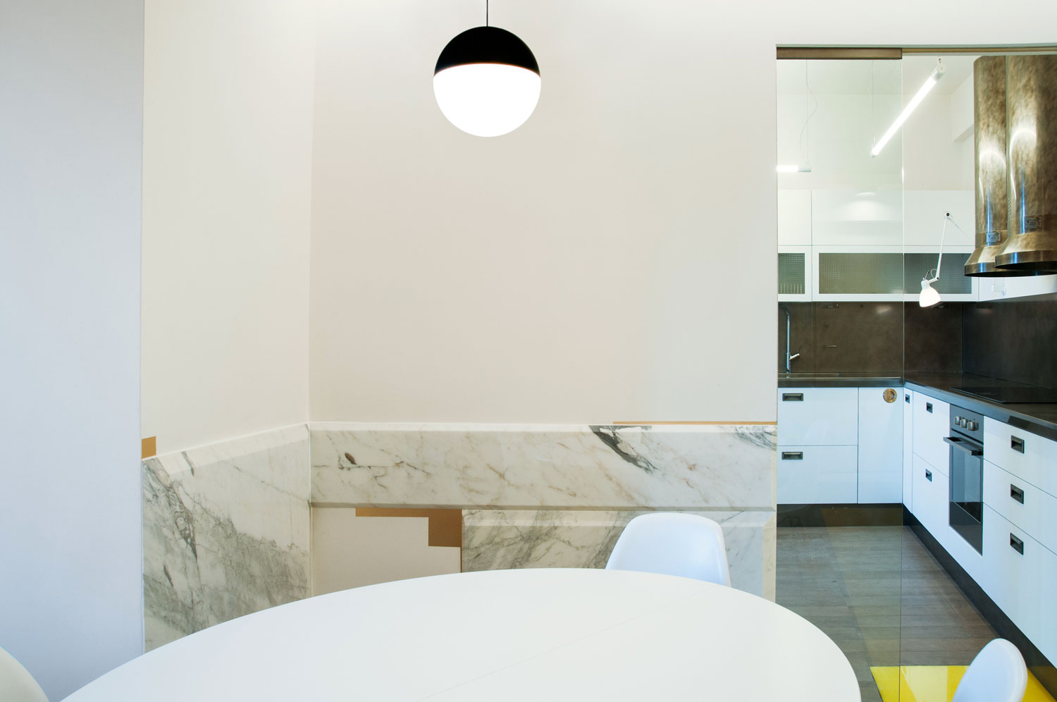
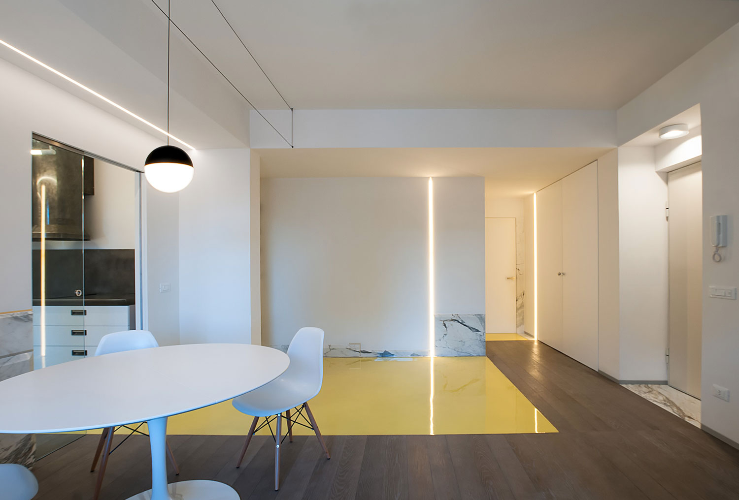
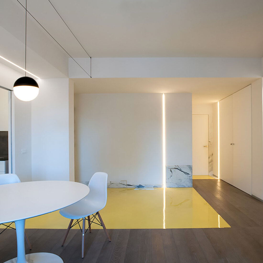
The use of ‘Calacatta oro’ marble, the connecting material, in all the spaces – and in between – gave them back thickness, embellishing them, emphasising them. This is the case in the dining corner with the broken down wall panelling alternating with golden inserts or on the skirting boards-painting along the paths, on the vertical thresholds that mark crossings or on the large squares framing the bathrooms.
In this interior, a person circulates through unprecedented iridescent landscapes that are not overpowered by objects, but marked by the space itself.
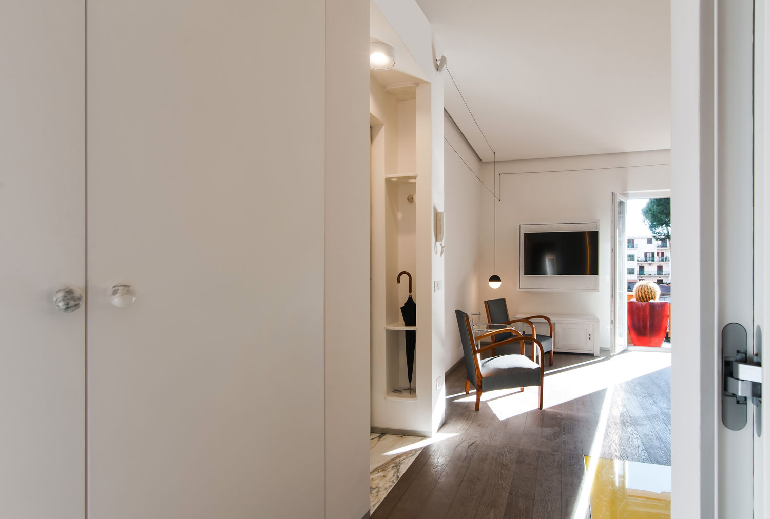
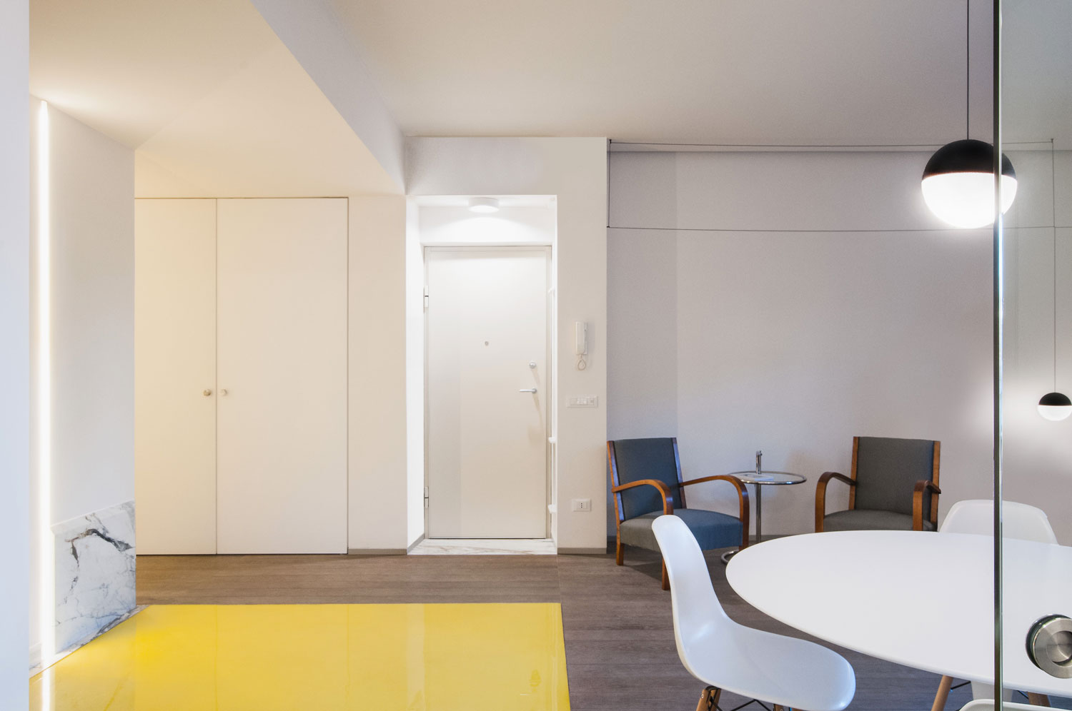
The entrance threshold, as always a theme of investigation, is marked by a marble carpet.
Vertically, an alcove contains storage shelves with offset gaps:
lower down for umbrellas, higher up for everyday objects (a headscarf or a scarf).
The gap machining waste becomes knobs for the large doors or hangers.
The horizontal definition of the home is entrusted to oak wood, with different length planks, two different sized resin carpets, and marble inserts;
It is a convertible interior designed as a fluid, moving space.
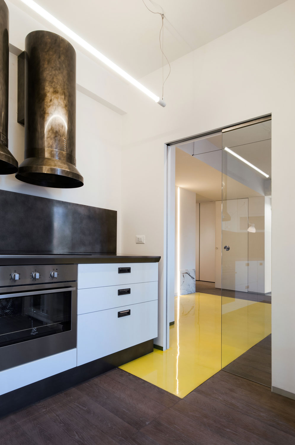
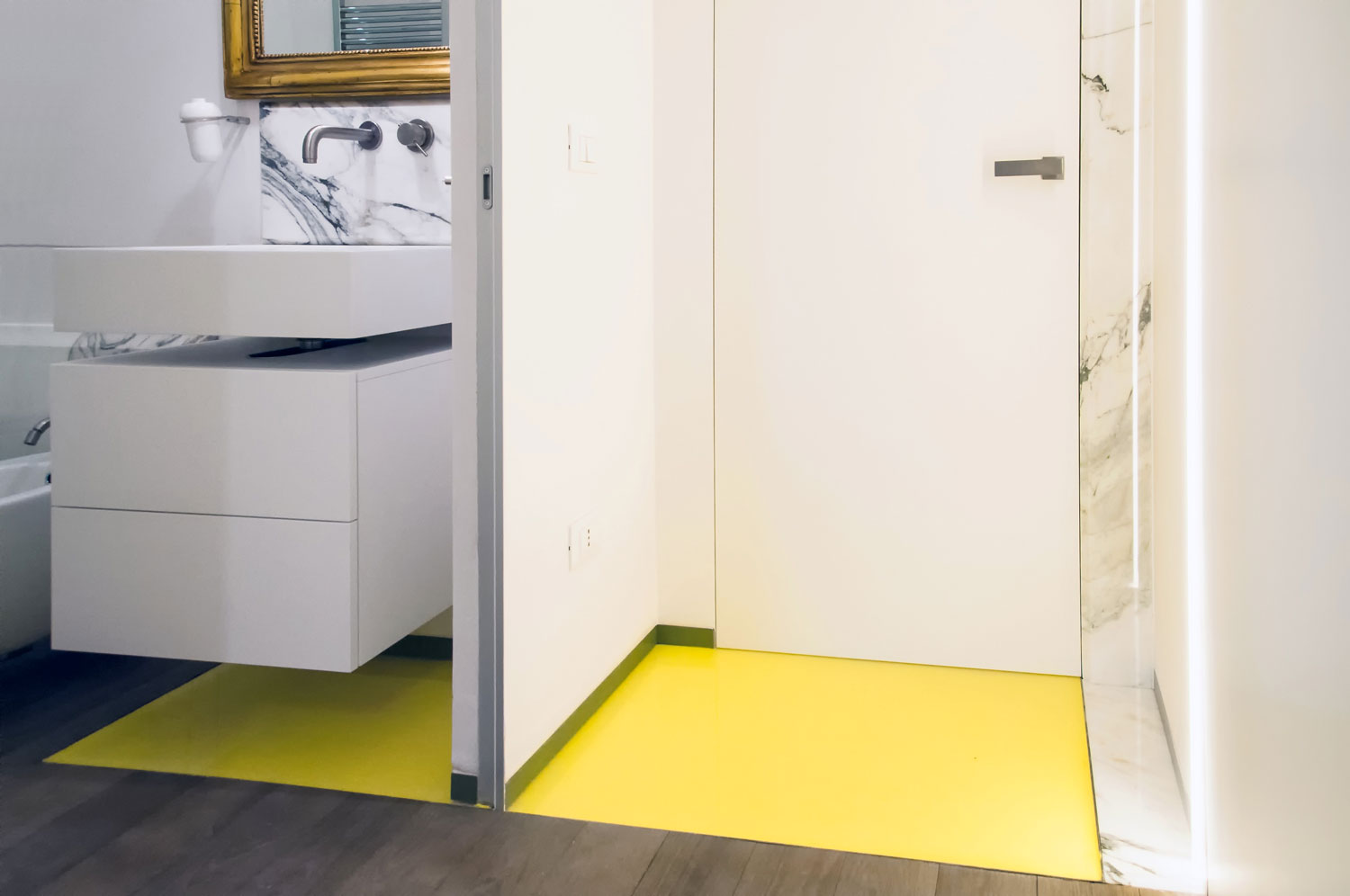
It offers alternative paths delimited by the strong signs of the two yellow carpets, mirrored wells of joy and light: they simulate the crossing through the walls, forming settings on the existing fabrics, like patches, returning them to man and his movement:
the transit passageways are extremely important, they welcome the dynamism of this small ever-changing nucleus
The vertical definition is underlined by the skirting board-paintings on the white walls.
The marks on the walls are in actual fact primitive signs and therefore heterogeneous in shape, material, colour and size, drawing equally composite views within the spaces of this home (marble or grey marine plywood on the walls and green on the carpets).
They are all unique pieces, tailor-made, with slanted cuts on the sides (75 and 45 degrees), devised to restore three-dimensional appeal to the material which is not placed on the walls here but seems to flow from them, sometimes amplifying the perspective and others slipping onto the passageways to frame them.
In the two bathrooms, the large slabs are used for the shower tray, or to coat the sanitary fixtures.
As you turn your gaze upwards, a black electric wire underlines the movement and accompanies your look, framing the spaces and becoming light.
The (double) corridor created by the wardrobe also leads to the master bedroom.
The storage unit is designed as a generator of a fluid and versatile space to accommodate a large storage unit, but at the same time be a useful space or wardrobe for guests when necessary.
The game of apertures of the two doors is one of the project’s strengths:
it is a diaphragm that in the various configurations delineates the perimeter of the paths, between public and private spaces; as they are closed and opened, the doors reflect spaces, people and things on the mirror.
This way I reinforced the primary concepts on which I based the entire intervention:
subtraction, amplification, breaking down and stratification.


